

If you want to see a chart that looks a lot like tiptoeing on the edge of a cliff, take a look at the weekly chart of the S&P 500 (NYSEARCA:SPY).
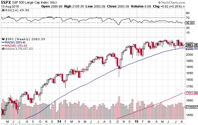 The blue line is the 50 day moving average. The last time it was tested was in October. It has now been tested five times in the last seven weeks. Its slope is also flattening, meaning the longer it is tested, the easier it is to break through the line.
How important is the 50 DMA? Here’s a look at a longer term chart of the S&P to gain a wider perspective on the 50 DMA and its correlation with bear markets.
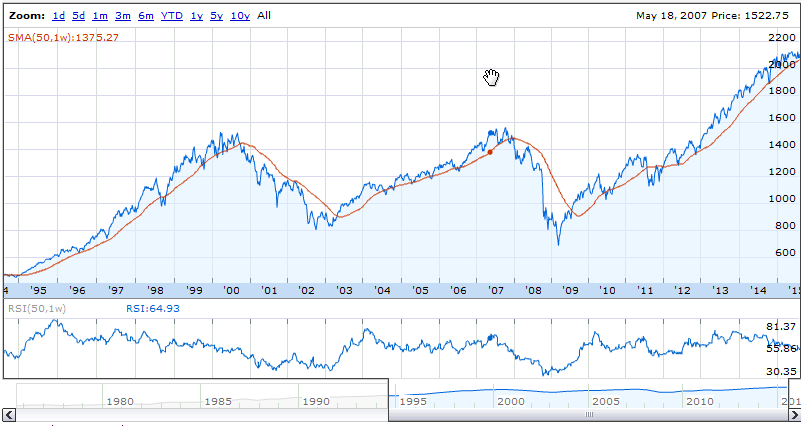 From 1995 to 2000, the 50 DMA was tested 7 times on a monthly basis. The last 4 tests were spaced by about 6 months. After that, the 2000 to 2002 bear market began. The market finally regained the 50 DMA once again in mid 2003. During the bull market from 2003 to 2007, the 50 DMA was tested 8 times, with the last 3 tests coming within a space of 5 months. Then began the 2008 to 2009 bear market.
Since bear market bottom in March 2009, the 50 DMA has been tested 6 times, counting the 2011 break as one, and the weekly tests are becoming more frequent now. Only time will tell if this is the top for the current cycle, but it’s looking more likely by the day.
After yesterday’s largest turnaround by percentage in stocks for three years, equities fell sharply in the final hour of trading on high volume, signaling a probable lower open tomorrow.
Meanwhile, mixed signals are everywhere as the Atlanta Fed has forecast Q3 GDP growth at just 0.7%, as weekly unemployment claims continue to rival the 2000 trough. Then again, perhaps the signals are not so mixed, as that unemployment trough came one month after the 2000 NASDAQ (Nasdaqgm:QQQ) top was already in.

 Intercept Pharmaceuticals (NASDAQ:ICPT) Gilead Sciences, Inc (NASDAQ:GILD) Clovis Oncology, Inc. (NASDAQ:CLVS) Chiasma, Inc. (NASDAQ:CHMA)")
 Might Be Moving Away From Its Initial Plan With Messenger")
 Is Running Right Now")